Font Experimental Book
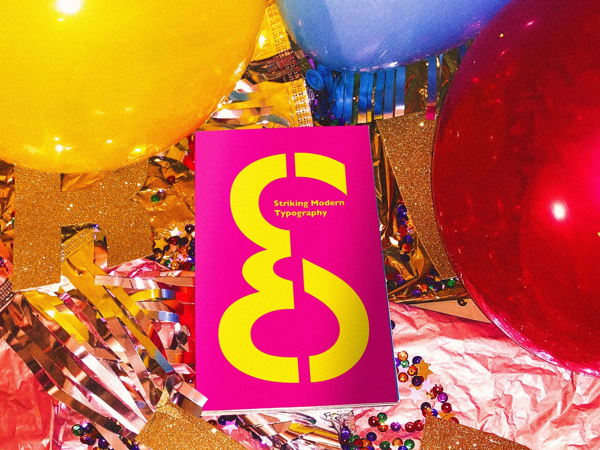
This book focuses on the typographer Eric Gill and his typeface Gill Sans created in 1928. It consists of a color system of eight colors, which integrates to the playfulness experience of the layouts. The idea of this piece was studying the typeface’s history and form. As it already has fun features within the lettering, when studying the typeface, I found about how it was used in the modern world, which something sparked in that moment. The typeface on it’s own was already seen as a modern typeface and I wanted to keep it in that sense. I found that the typeface, was used for one of my favorite childhood movies, Toy Story, that’s what brought into scene the idea of the colors, composition of layouts and the tone.
Fall 2019
Task
Editorial design, discovering and understanding the uniqueness of Eric Gill’s typeface. Learn the best qualities of the type’s form and what could be the best way to display the font through research on the history and what makes the font important and how it was used.
Strategy
Type studies, Backstory research, Experiment, Perspective.
Tools
Indesign, Illustrator, Photoshop
SKETCHES
TYPOGRAPHY
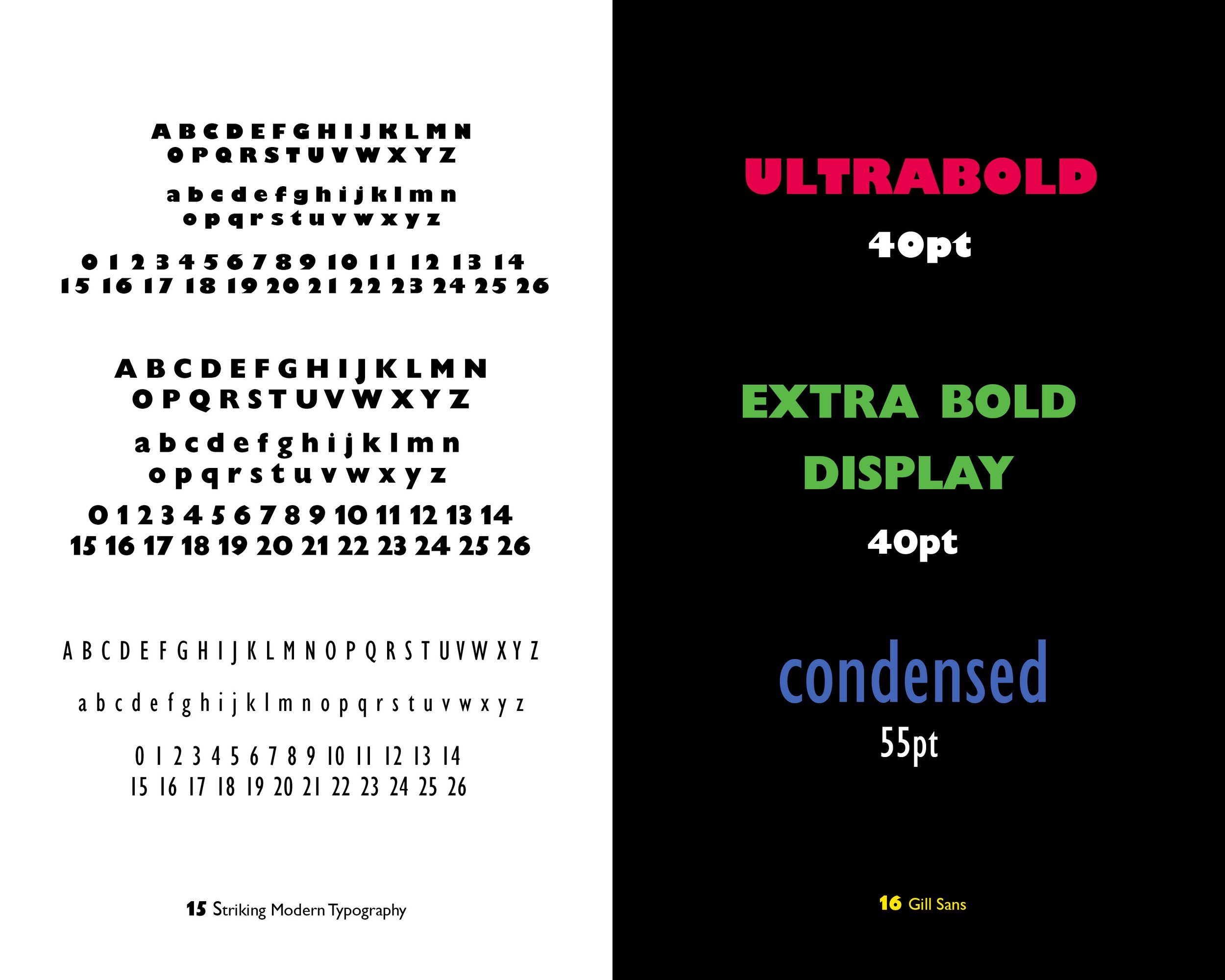
Gill Sans — Condensed, Ultrabold, Bold, Extra Bold Display
COLOR PALETTE
The combination of the eight vibrant colors with the form of the family typeface styles and glyphs brought a greater connection to the fun and bold displays. Working with color theory, having a mix of warm and cool colors gave a nostalgic feeling. Complementary combinations were made to have a balance within the design system. Colors such as red cherry, lime green, ultramarine blue, and tangent orange. Emphasized these colors with additional tints and shades.


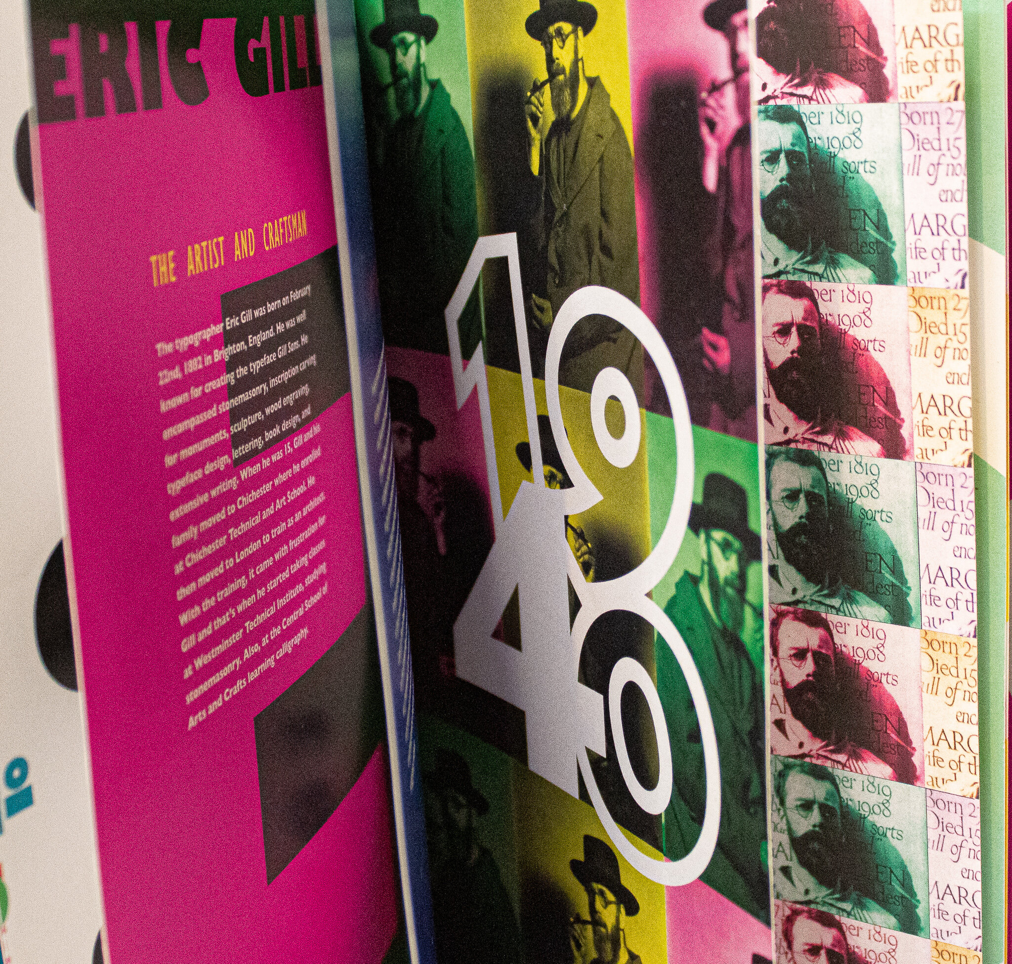
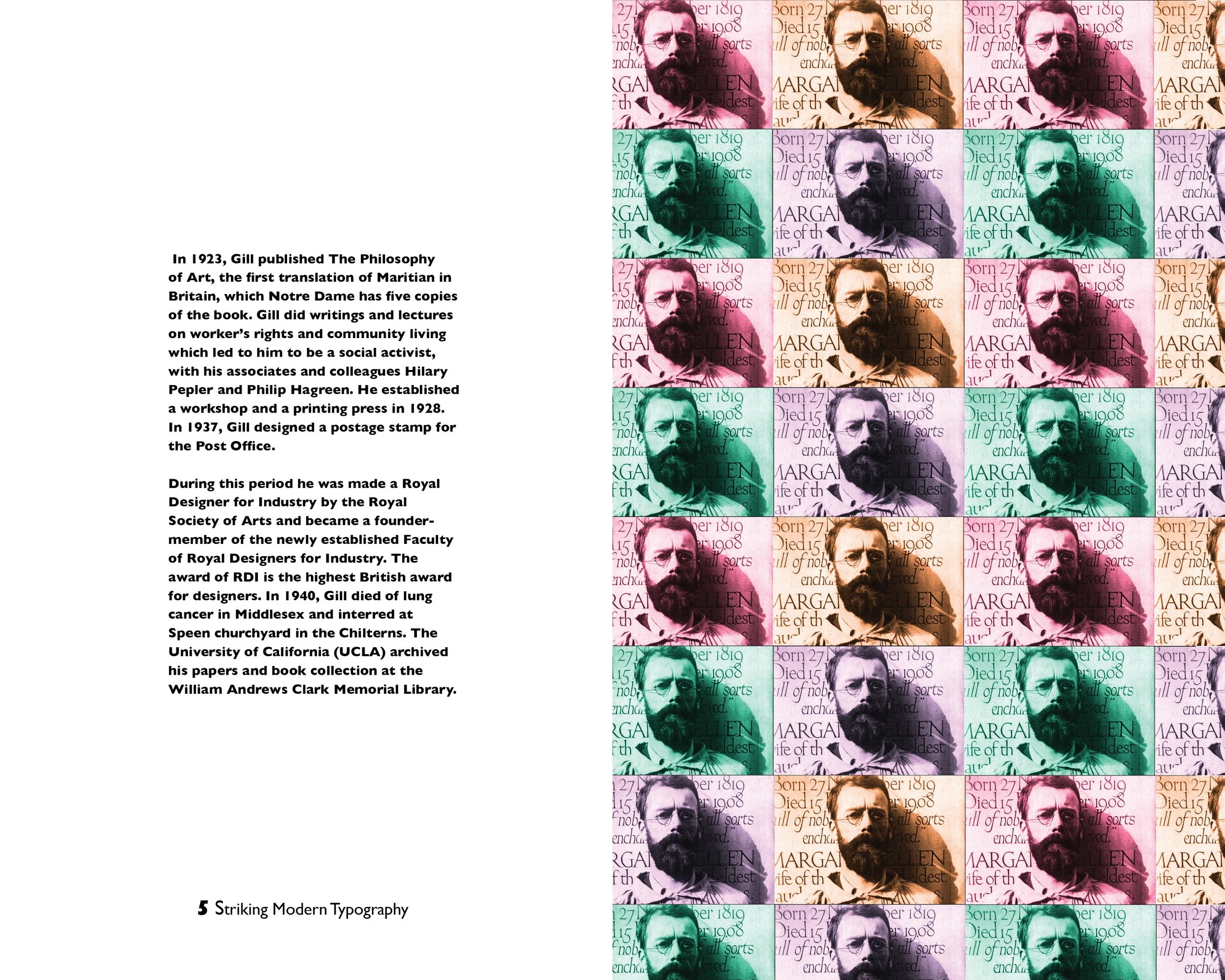
The postage stamp repetition layout, was inspired through the learning about Gill’s designing a postage stamp for the post office in 1937. Looking at the photo on its own gives you the look of a postage stamp through the way the photo was taken and with the text in the background as texture adds to the scene.


The typeface family was used for environmental and editorial design, such as the Penguin Books and the London and North Eastern Railway and later British Railways. As discovering more about the font, condensed, ultrabold, bold, and extra bold display, felt they could be the best styles to showcase. Bringing out their special characters in different sceneries. The integration of enlarged lettering embraced the modern and bold outlook of the typeface.


COMPLETE SET OF BOOK


