Euphonic Sparkling Water
The brand is all about giving an experience to the consumers. This sparkling water stands out with bringing your taste buds alive filled with joy and warmth into your soul. Flavors that spark how someone makes you feel, how hearing your favorite band sing live feels, how a certain memory, brightens your day and brings that unexplainable feeling. Wanting to keep reliving those experiences and living more in the moment. A moment where you can let go and feel free without thinking of a tomorrow or what is gonna happen in a year; because right now in that moment it is what is important.
Winter 2022
Task
To create a sparkling water brand different from others out there. Apart from including fruit combinations that would not necessarily go together and some do, there was real fruit with pressurized sugar with Co2 to create the sensation that the Pop Rocks candy do; for the drinks to create this joy to the consumer to enjoy and bring nostalgia back in their lives.
Strategy
Concept, Branding, Nostalgia, Music, Psychedelic
Tools
Illustrator, Photoshop, Tablet
LOGO
Before
The Round Serif typeface already has character to it , which I wanted to enhance on it by making it more organic and handwritten. A reflection on how the flavors and brand wants to make the drink feel and taste. It was modified in four versions before the last version. The corners were smoothed out, made thicker and looser. As a sparkling water, the letters were moved a certain way, some tilted and through the spacing between them, created fun silhouettes. Imitating bubbles and the sensation of the drink.
After
COLOR PALETTE
Colors were a mix of psychedelic combinations, inspired by movies, tv series and music that was listened during the moment of creating the project. The movies Last night in Soho, This is the year, and tv series Euphoria. Music from Lovelytheband, The Band Camino, Labrinth’s Euphoria Soundtrack. A mix of warm and neon palette to bring in the feeling of being reborn, ecstatic emotion and discovering yourself.
TYPOGRAPHY
The type Blanch Sage was used for the logo, which was reworked in some lettering and other letters were handwritten, to give more of a persona, that relates to anyone. Coolvetica was used for as a secondary text to create contrast between the brand’s name and the additional information.
RESEARCH

FLAVOR ILLUSTRATIONS
BEFORE ILLUSTRATION IDEAS FOR MAIN SYMBOL
FINAL ILLUSTRATIONS OF MAIN SYMBOL
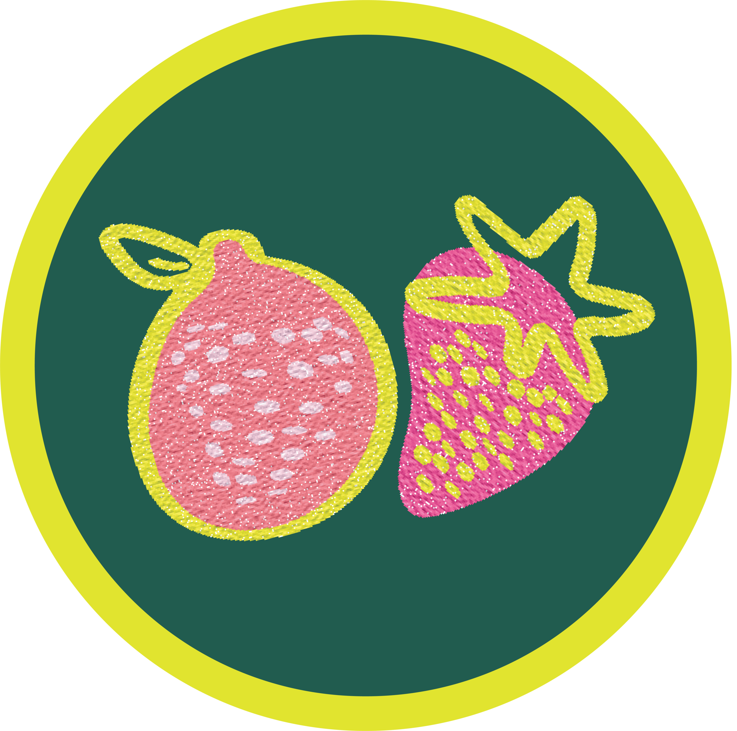
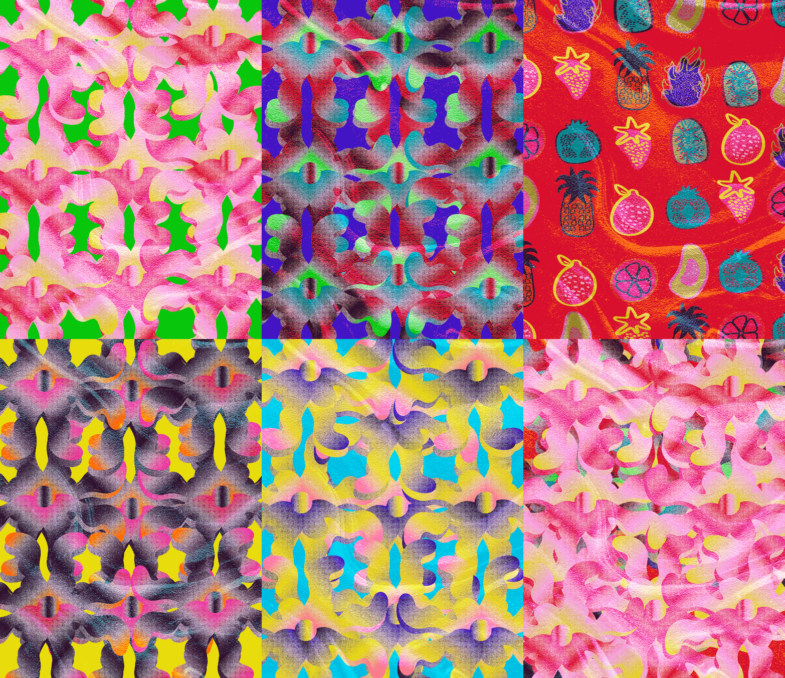
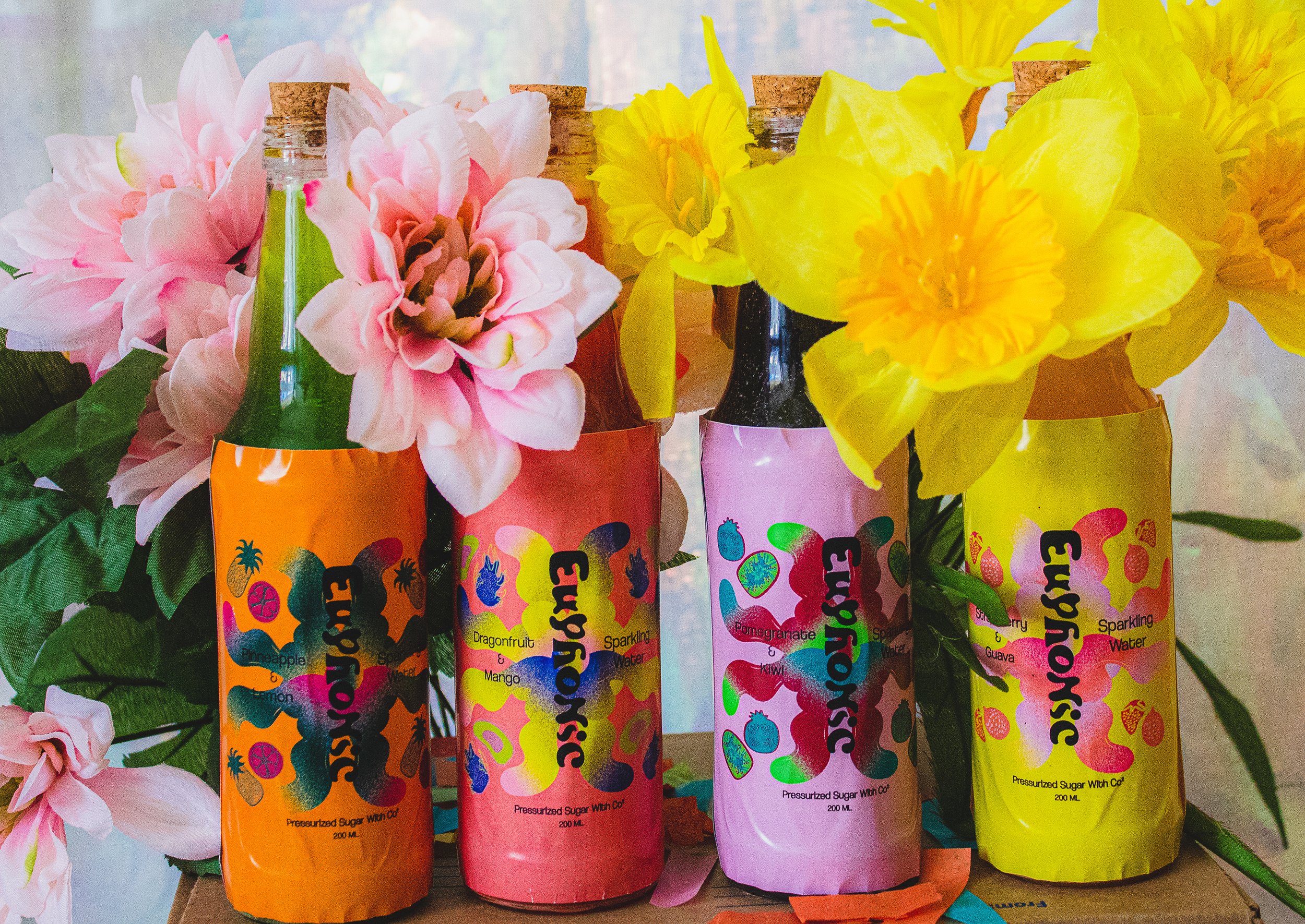
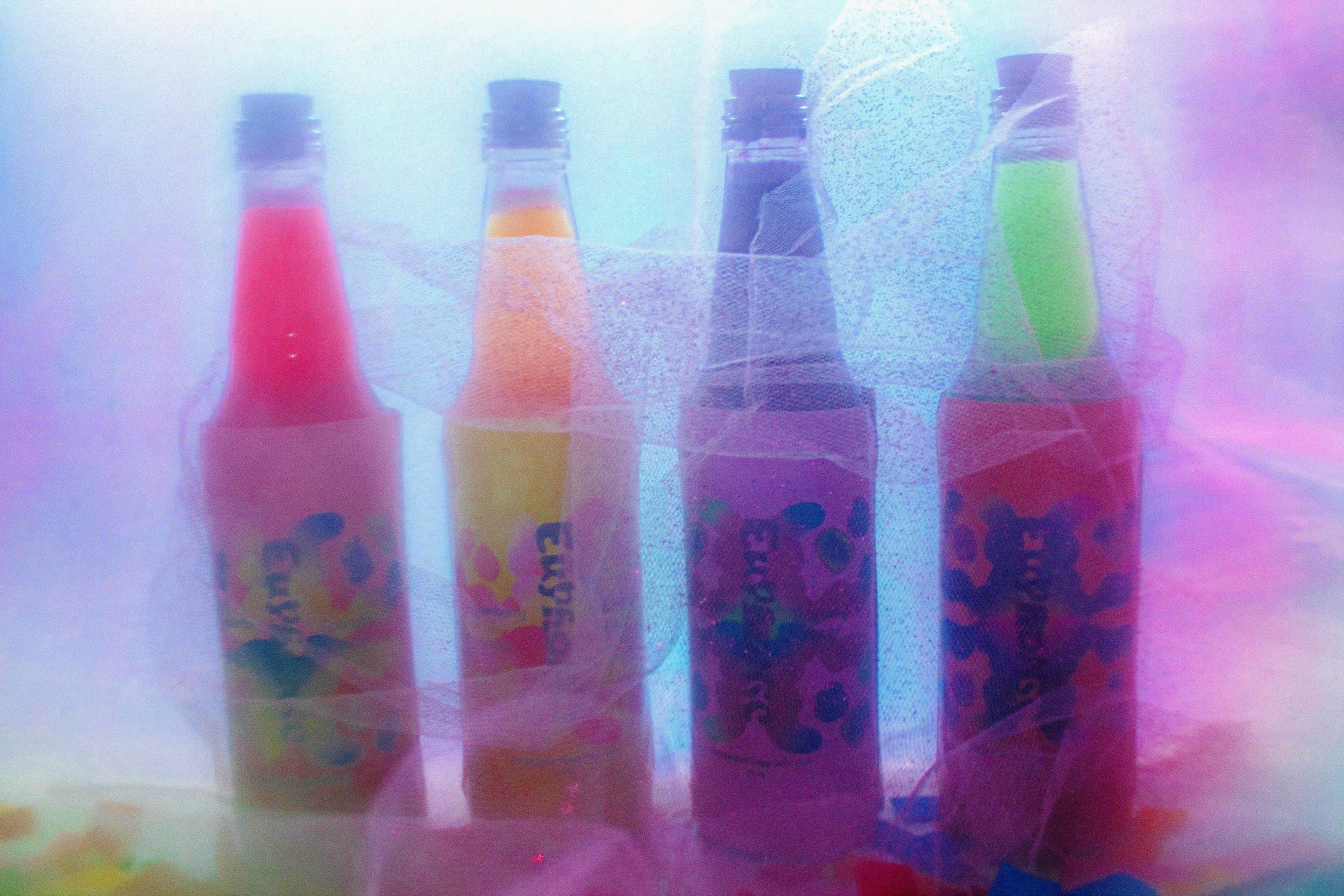
From the variation of color palettes used throughout the brand, they were picked out to create gradients in order to present the flavors of each sparkling water. The symbol is a mix of an abstract flower / firework and festival inspired character that was free hand drawn, while listening to music. Flavors: Pomegranate & Kiwi — Pineapple & Lemon — Strawberry & Guava — Mango & Dragonfruit
BOTTLE LABELS
Label Size: W: 3.75 In X H: 5.25 In
COLLATERAL DESIGN
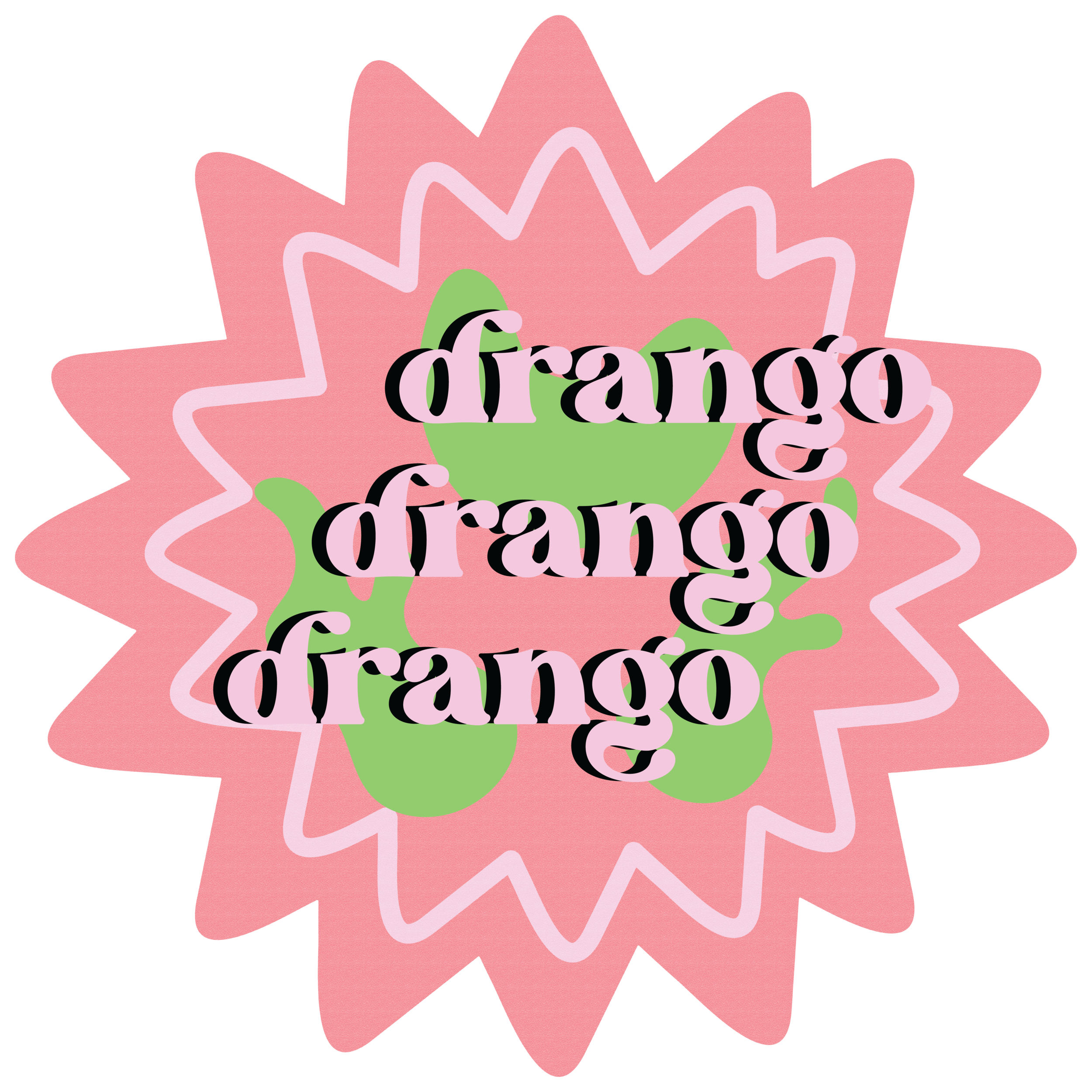
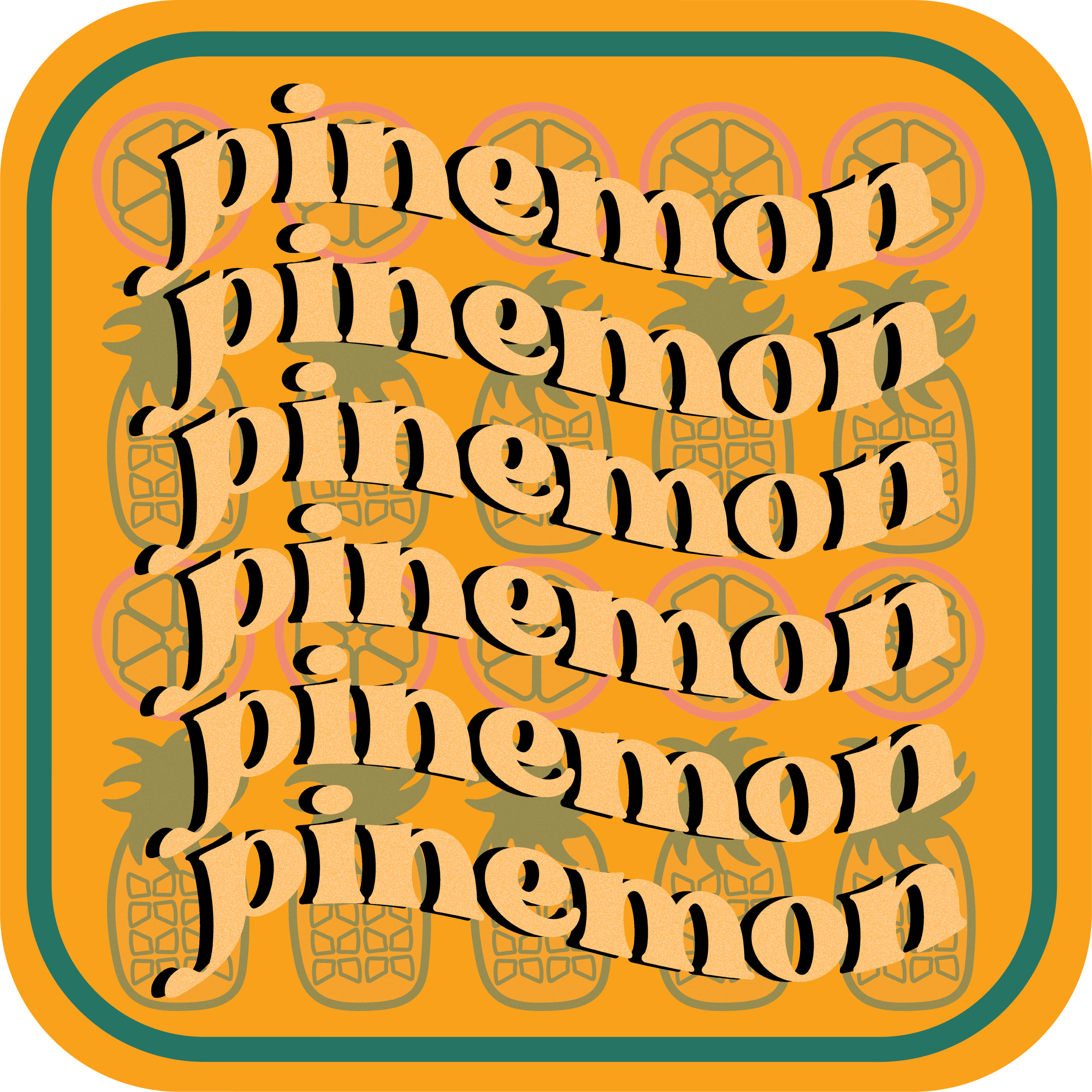
STICKERS
INSTAGRAM POSTS


