McDonalds Banner
As getting through a global pandemic, personnel has either left the company or have chosen to stop working. The purpose of creating this poster banner, was to give customers an opportunity, to be part of the team. Motivate them to apply and that there is still hope in finding a job and in gaining experience of the real world. Guide them to start from somewhere.
Spring 2021
Task
To create a banner signage for hiring and maintain a minimal design that contained location, contact information and headline/subhead text. Be effective for hiring new personnel. To keep their main color palette with the logos either being the M on itself or the M with their slogan, Im Lovin It. For typography to have a bold and friendly outlook. No required size, just to be big enough to be visible for customers.
Strategy
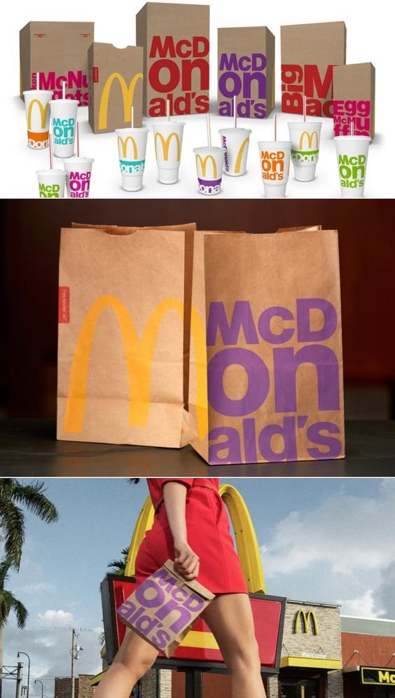
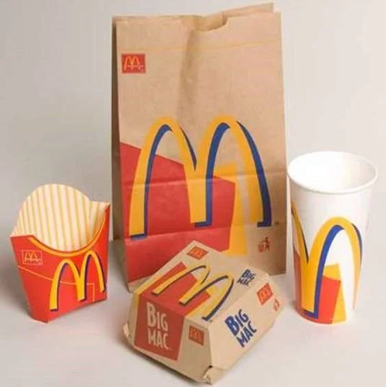
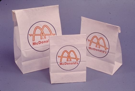
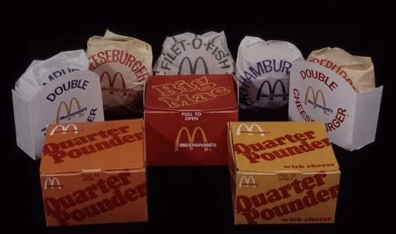
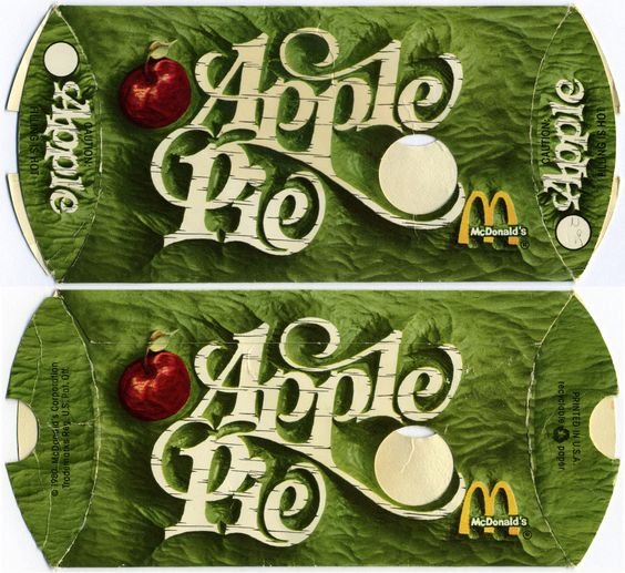
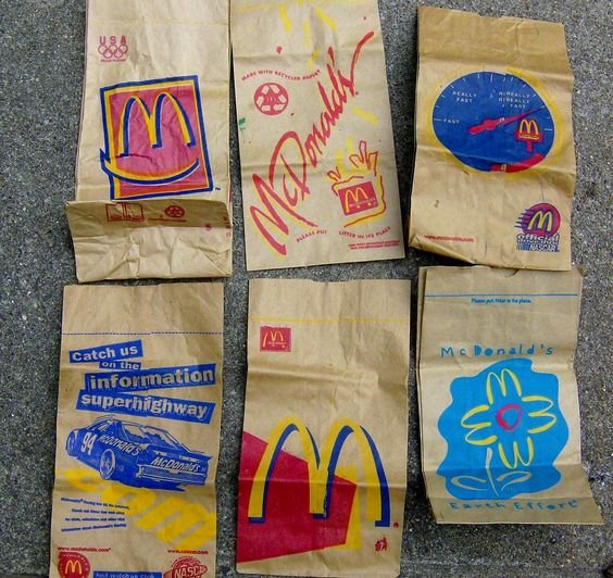
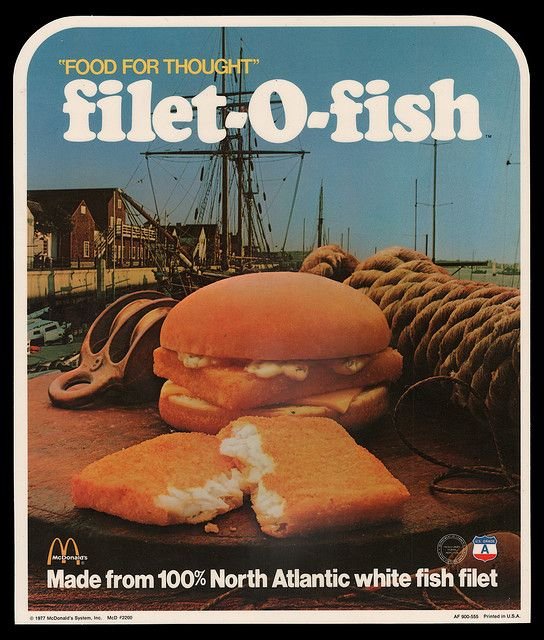
Meeting with the boss and manager of McDonalds, Imagery research and research in back in time branding for company and modern poster styles, Minimal information but effective.
Tools
Illustrator, Photoshop, Tablet
Client
McDonalds from Chula Vista, CA | Locations: Imperial Beach and Broadway
LOGO
COLOR PALETTE
TYPOGRAPHY
Finding a typeface close to the logo’s letter treatment, to keep a consistent outlook of the company. It was effective in both upper and lowercase. As this was the only typeface used for the posters, there was many versions created to see how the information would be balanced and in what direction it would be placed in.
GRAPHICS
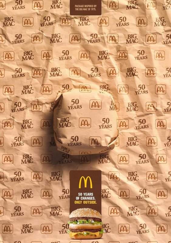
RESEARCH
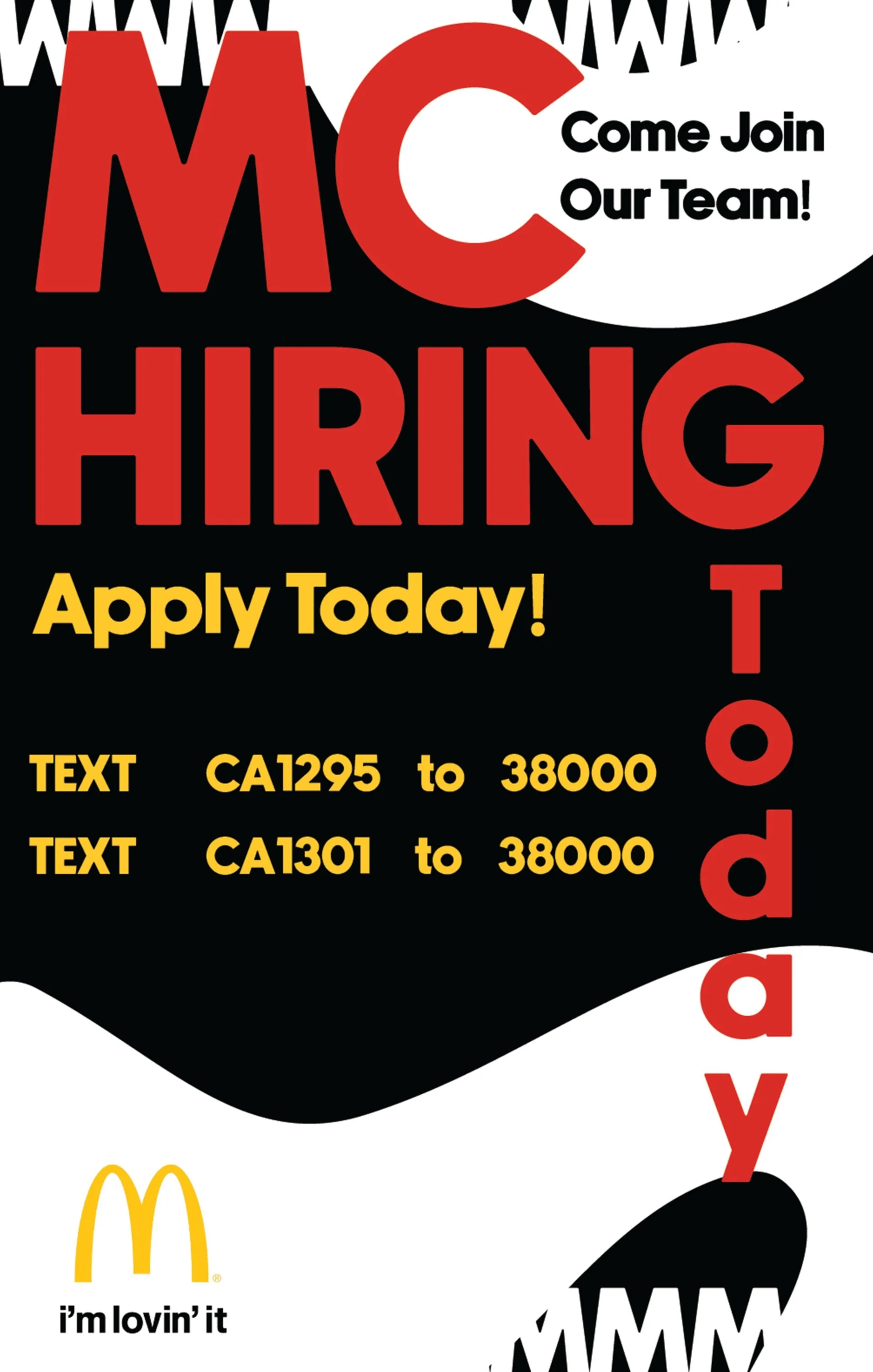
DESIGN EXPLORATIONS
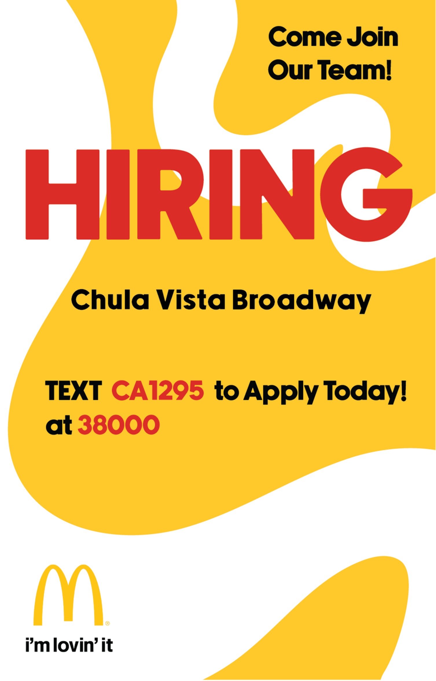
FINAL DESIGNS
Poster size: 11 X 17 IN
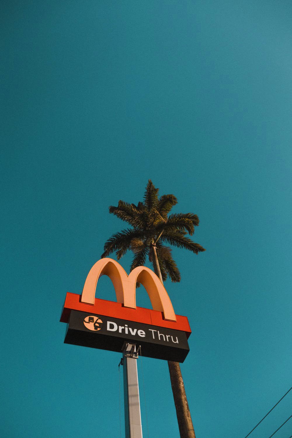
BANNER IN PERSON
Banner print: 4 X 10 IN | 60” width


