Zine Book
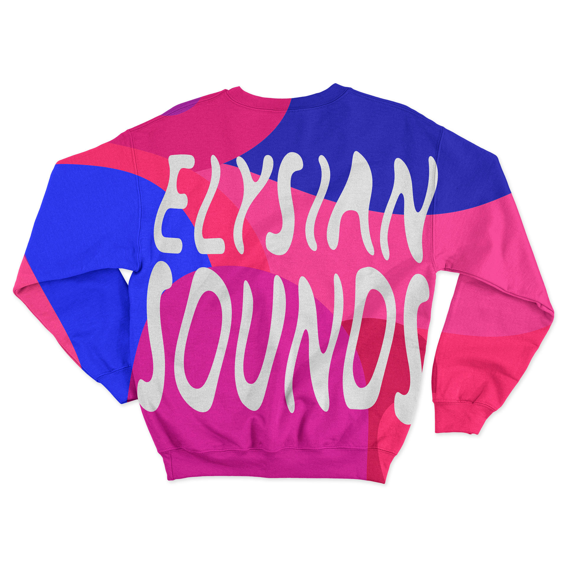
The zine was a way of expressing how music makes me feel. Enhancing communication, writing and photography skills. Having myself be one of the subjects in the project was an important element, for the viewer to feel a greater connection on what I am passionate about. A representation on where I want my career to lead towards to. As a designer showcasing a part of who I am and giving a direction towards being part of the music and entertainment industry. Being experimental through it all by setting a time, tone, color, scene, subjects and typography. Discovering the abilities my senses have, when listening to different sounds and genres of music. Through these compositions of self expression, were a form of escaping the real world. I wanted a name that reflected to that, which then Elysian was a word I found to be the one that called to me, which is another word for something relating to heaven or paradise. Throughout the layouts of lyrics there was a mix of handwritten and existing typography to represent my mind and what the songs made me feel.
Spring 2021Task
Working with the medium zine to interpret seven songs through the magic of nature, makeup, style and facial + physical expression.
Strategy
Art Direction, Passion Project, Experimental
Tools
Illustrator, Indesign, Photoshop, and Lightroom
RESEARCH
COLOR PALETTE / TYPOGRAPHY
Mrs Eaves, Typographica, Sonders Sans and Battery Park typefaces were used for displaying the pages containing lyrics. Gill Sans family styles, were used for text on front and back page of zine, small text in pages and listing of songs on contents page.

COTTON CANDY
YUNGBLUD
Is about being exactly who you are, loving whoever you want and receiving the same love back to you. Through the meaning and the rhythm of the song, there is this groovy and playful feeling. I pictured a scene, of having the time of your life with the one you love. A celebration together. Valentine’s day was coming up and the decorations were put together to form the tone of the song to the colors and create an aftermath of a party. The typeface was created out of a 40 pt. flat brush tool to create a cloud form of lettering to connect with the title of the song.

JAWBREAKER
MACHINE GUN KELLY
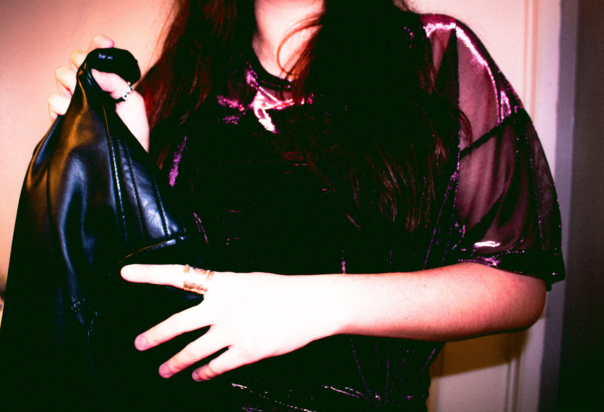
It is about loving this person, getting to see their true colors and loving every part of that person. Mesmerized, I wanted to create a scene connecting the artist’s look in the album. Brought into scene a mystery person to be the representation of exploring the city with the person you love, in a set time in the evening to bring the purple, hot pink tones. Listened closely to the instruments, to take in the movement of the beat into creating the form of the typography.

VIOLET
HIPPO CAMPUS
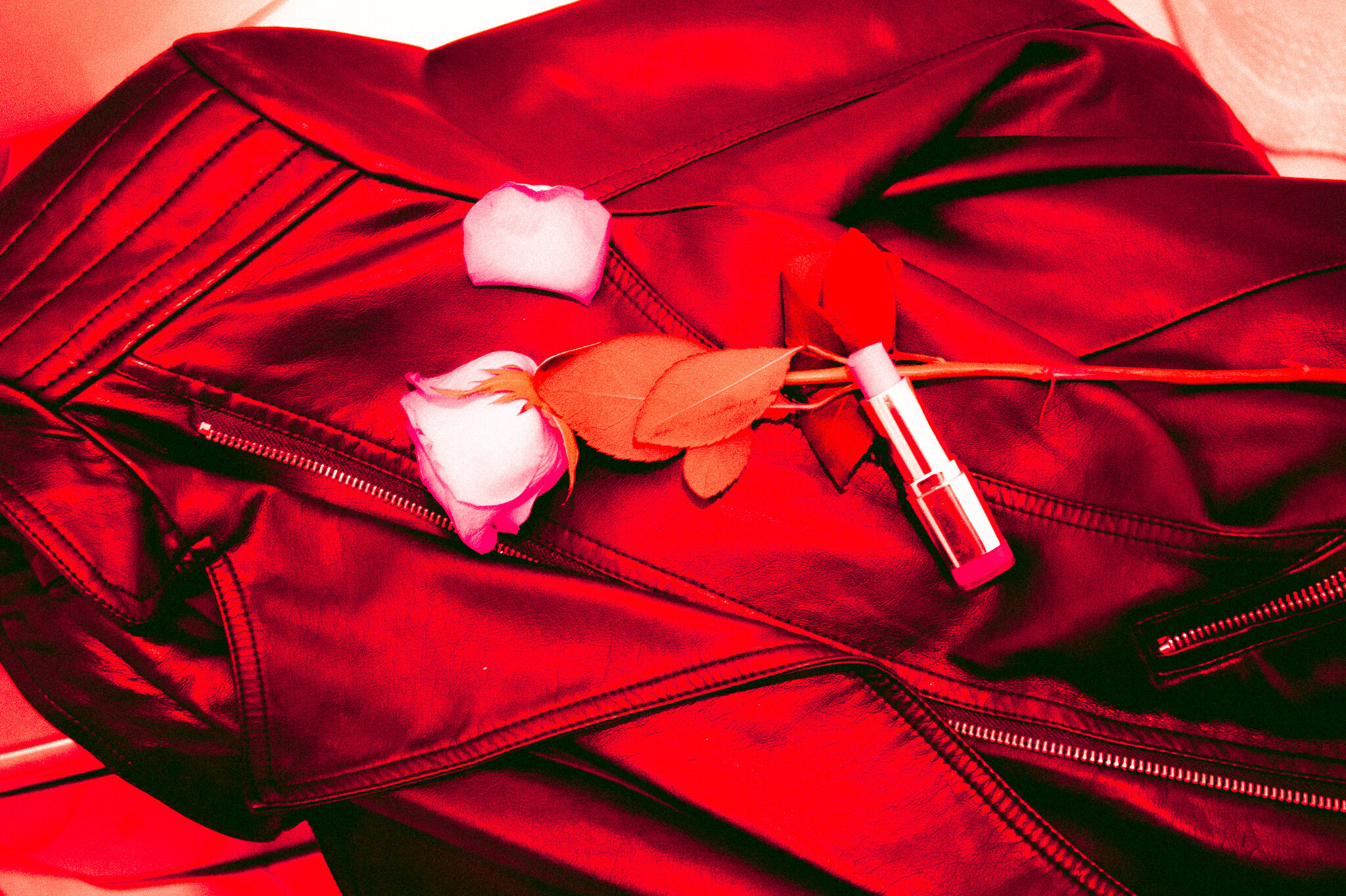
The sound of this song could have gone both ways, on how the scene could be pictured. From going to a road trip, getting lost with friends and running through an empty street feeling this freedom go through your veins. To a rock n roll scene, in your rebellious phase. Making a statement. I got the thought on the first scene through the beat of the song and the second thought through what the lyrics are saying. Going with the second scene, I knew I wanted bold enlarged lettering and a type that had texture to connect to the scene, and with the writing in the mirror with lipstick.

AEIOU
JACK OMSTEAD
The lyrics are created like a poem with how they rhyme, but in a playful tune. From what I understand the song is dedicated to someone they like, complimenting them and trying to get their attention. The beat has this moment where it sounds like a video game and the direction for the scene was to display primary colors into the scene out of random objects. Objects I gathered from the kitchen, to a past project to the choice of jewelry and jean jacket I had designed. For this I knew a lowercase geometric typeface would fit to the pop of the song. The direction of the words and scaling helped enhanced that feeling.


ANYONE
JUSTIN BIEBER
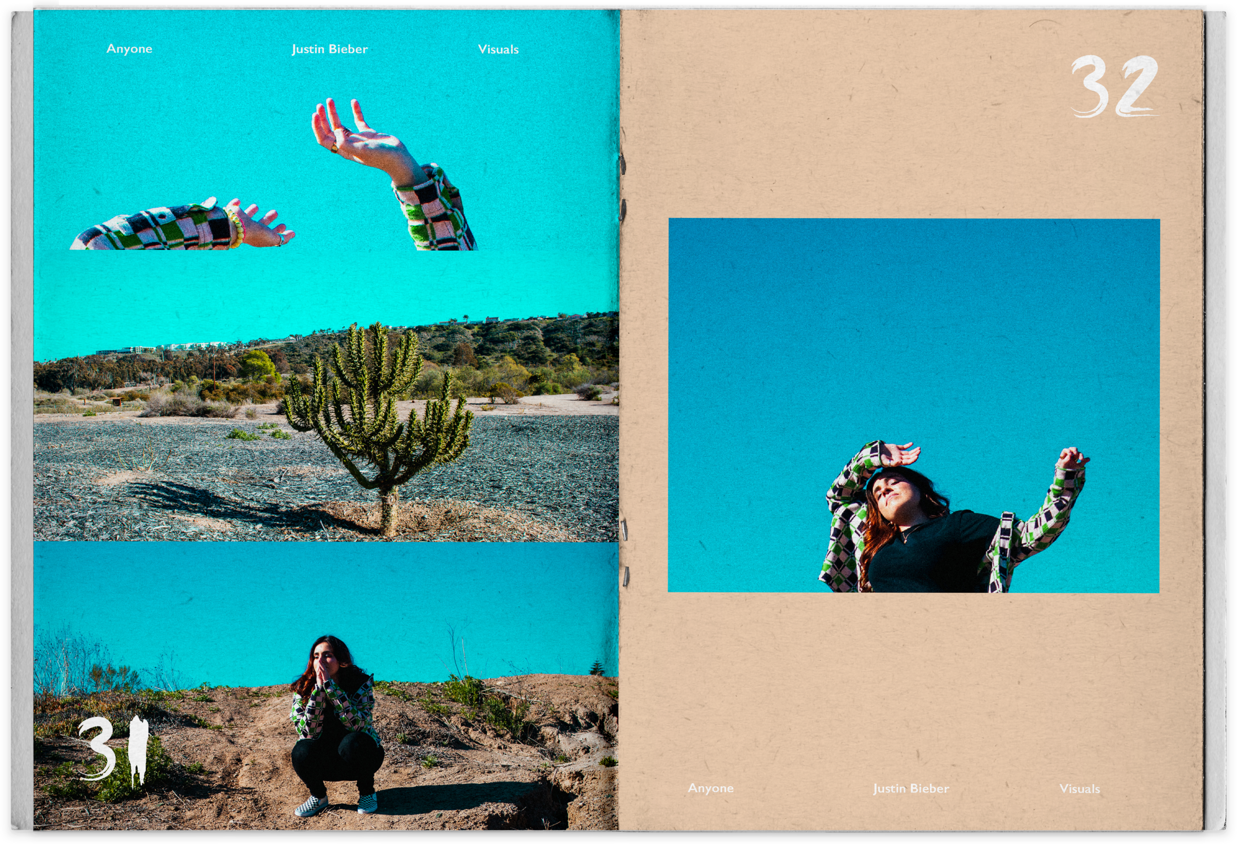
Is about being scared to lose the person you love and letting them know that you be lost without them. They are the only person they truly love and are the reason they have this greater happiness. Through hearing closely to this song and feeling it in my heart, I felt this elevating experience. Had me picture myself being in a deserted place, screaming on the top of my lungs the person’s name that makes me feel alive again. This free spirit moment being one with nature. Capturing the blue sky and the sun being really bright that day, really made that elevating feeling. The typeface was designed to be seen as a love letter and have this delicacy expressing how you care and love that someone important in your life.

BEDACHE
CHRISTIAN LEAVE
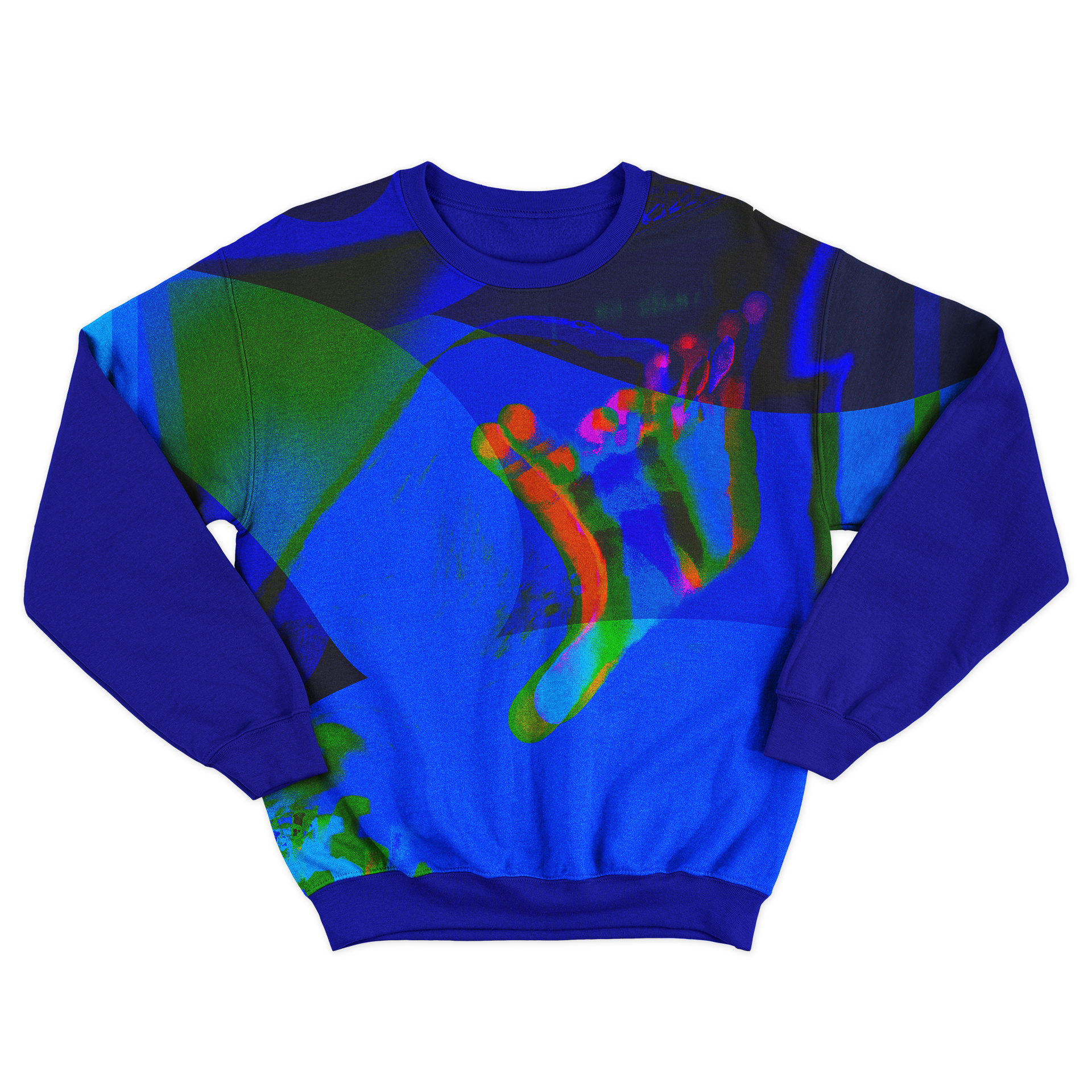
Is a indie pop song about growing up too fast and getting lost in the way. The lyrics have this genuine and dark tone to them. A song that many can relate. From the captivating lyrics to the tune, I started seeing these multiple of colors being projected through lighting and in a dark room to resemble back to the meaning. Expressing how chaotic it can be finding your way back or out of the mental state you may be stuck in, feeling like life is moving too fast and it is hard for you to catch up. Figuring out who you are and what are you going to do next. With a project I created these hallucinogenic scenes, having my facial expression and hand movements enhance that feeling. For the type I wanted to create a scattered effect of having to many thoughts in your head.


ILYSB
LANY
This song is about being crazy in love with someone, having this unhealthy obsession and an unrequited love. Compared to the meaning the sound has a very calming tune. I wanted to have this mystery perspective of the camera being the “obsessed” person viewing the person they like in every detail. From the face to the hands, in a mix with flowers expressing the love. A scene that gives an insight look into a date.


