A Reason To Survive (ARTS)
Designing an eco friendly package system that has the ability to contain various art and craft supplies. To support students part of Arts@Home for their classes. The client was open to ideas and options in ways that the students could express their creativity, through the box in how they would customize it.
Fall 2020
Task
It was required to offer a box that could be reused, be able to be stored flat, and for the cost to be under two dollars. For the assemble of box to be simple. Box ability to customize for different classes and no usage of glue for packaging.
Strategy
Gather and organize information provided from client and description of assignment for a better understanding. Research on stable box options. Giving the box a purpose and for the students. Practice building up box ideas. Simplicity on design for more open freedom of creativity for students.
Tools
Illustrator, Photoshop, Lightroom
Client / Team
A Reason To Survive
Co Partner // Michelle Fernandez
LOGO
TYPOGRAPHY
Logo and typeface was provided for usage throughout the packaging.
COLOR PALETTE / ILLUSTRATIONS
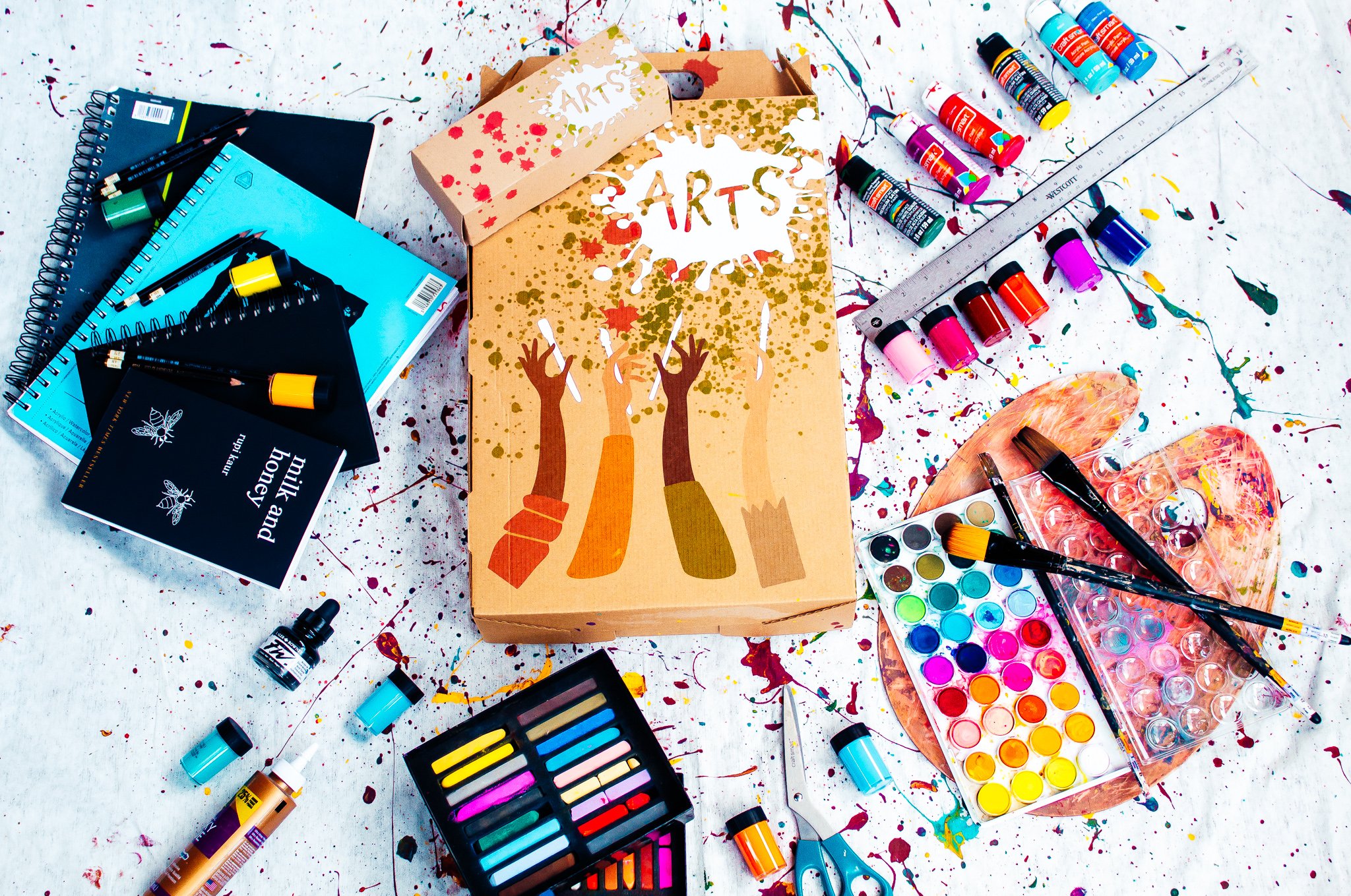
Splatters were used to maintain consistency and harmony within the logo. The colors green and pink are gender neutral, to relate to everyone. Paintbrushes indicating the importance of the program and were left in white to express open to creativity, as a blank canvas. The arm illustrations are a representation of unity and the integration of different skin tones are to represent all students. Indicating the students how important they are in the ARTS community and see themselves in the piece.
RESEARCH
PROBLEMS ON CURRENT PACKAGE
Not customizable
Not portable
Did not have much uses
Did not work for all classes (some materials not holding up)
ADJECTIVES
Community builder
Creative compassionate
Courageous
Youth
Transformative
Craft
Compact
Portable
Splatter
DIELINE
SIZES / “11.5 x 3 x 17.5”
SIZES / “3 x 2 x 8”
VISUAL DESIGN OPTIONS

The main goal for the design was to express the meaning of the brand ARTS and look more into the purpose in being a part of this community. The importance of students to find themselves and have a form of expression through art. This packaging had to have the ability to store multiple types of art materials and be able to be reused. No added glue.
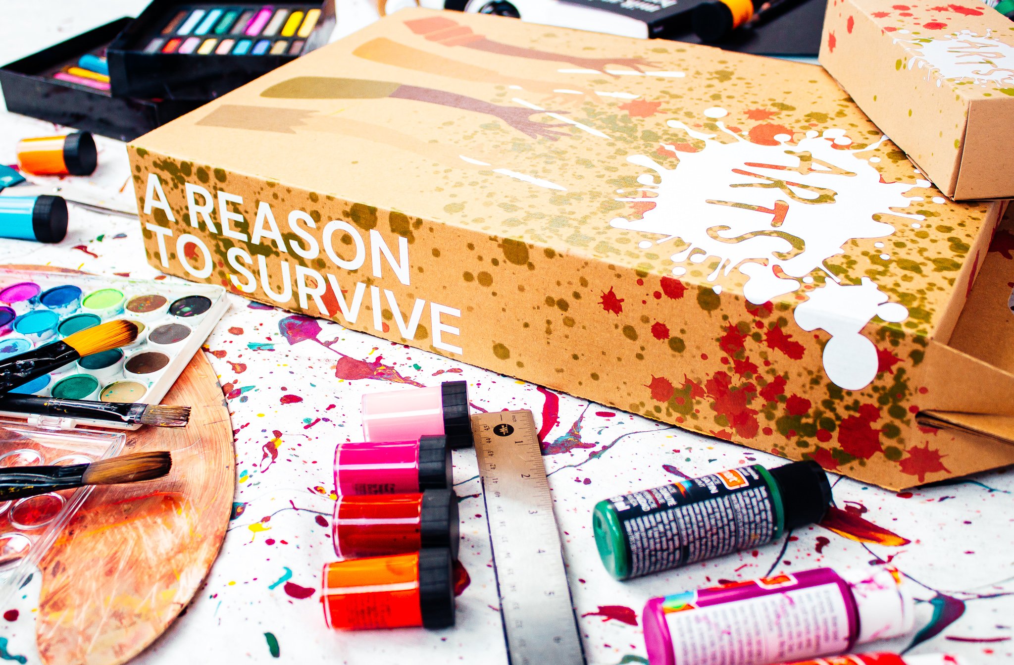
The thought process for primary box design was a mix of a suitcase and takeout box form to be more functional and lightweight. For the students to be able to easily open and close the packaging and store different types of materials for the variety of art related classes. The smaller box being the secondary packaging is to contain materials such as pencils and pens. The logo was provided for us, the choice on the white logo we found would be more readable and indication that it was the logo, when it came to the additional color design choices. The placement of the logo was to create good negative space. We found their slogan A Reason To Survive to be an important addition for the box.


